GINN: Geometric Illustrations for Neural Networks

JUMP STRAIGHT INTO THE ILLUSTRATION APP
Neural networks are often regarded as difficult to understand or interpret. Visualising their functionality and how they learn is challenging and has driven many research and engineering pursuits. In this blog post, we will take a step back from complex and high-dimensional domains (such as natural images). Instead, we structure a fairly simply problem that is neatly visual in order to interrogate some properties of neural networks.
It is typically not useful to consider the elementary components (neurons) that constitute neural networks individually. From layer to layer, it is the weighted linear aggregation of inputs and adjustments (biases) that gets fed into a non-linear activation function. This particular combination of inputs dictates how a neuron makes use of its activation function. For the purposes of this post, we will only consider the ReLU:

where the non-linearity boundary is marked with the red circle. Despite being a simple function - the maximum of zero or the input - the ReLU class of non-linearities is widely used. It is usually not the activation function that allows a neural network to model complex functions, but rather the interaction between all the processing elements. In this post we will study both the complex interplay between neurons at different layers as well as single neurons themselves. We do this by inspecting the non-linearity boundary (the red circle, above) over an entire data-domain. As you can imagine, a simplified and illustrative data domain is necessary for this. A similar set-up was used here to paint images.
The set-up
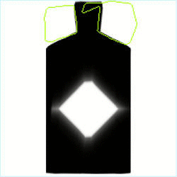
To visualise the interaction between a domain of data and neurons we consider as inputs pixel locations of an image. No, not an image, but rather individual (x, y) pixel locations (normalised between [0, 1] for simplicity). The predicted probability output of the neural network answers: is this pixel black or is this pixel white? We set this up as a classification task for simplicity.
The network

This neural network has three hidden layers, each of which have sixteen neurons. It was trained by minimising the cross-entropy loss over 1,270,000 iterations, each of which consists of a randomly selected minibatches of 128 pixel locations. We used the Adam optimiser with its default hyperparameters, and gradually reduce the learning rate to zero using cosine annealing.
The entire data-domain is the image on the left. Therefore, the function that this neural network is modelling can be visualised and interpreted by processing all pixel locations to produce something like the image on the right. Note that the above predicted visualisation is for demonstrative purposes: the network does do better than this!
The demonstration
This web application demonstrates how the neurons in this network behave throughout learning. There are three ‘good’ runs that converged satisfactorily and one ‘bad’ run that failed to model the central diamond. Feel free to head over there and play around with this tool. Analysing a single neuron’s non-linear boundary throughout training gives an intuition for how these elements coalesce into powerful function approximators.
When selecting a neuron to visualise, what you see is the non-linear activation boundary defined by the ReLU function: when it moves from a region in data-space that triggers the activation to be on or off. Stacking these non-linear boundaries can be interpreted as inducing a more finely granulated interpretation of the data space from which to make decisions. To visualise this, take note of how the later layers can branch off earlier layers to create more complicated line intersections - this is easier to see when selecting only one neuron to visualise in the last layer and finding its contributing intersectors in the layers preceding it.
All too often it can be difficult to understand just what neural networks are learning, how they arrive at a converged state and solution, or where they put their ‘energy’ (i.e. decision making power, in this case). What this visualisation offers is an attempt to give an intuitive grasp as to how layers in a neural network interpret the data domain.
Training the neural network with different seeds generates unique demonstrations (1, 2, 3, and 4). There are three ‘good’ results and one failure case to choose from. After playing with the demo you might notice some intriguing phenomena. First, lets take a look at a full sweep of one of the good runs:
All non-linear boundaries for a training run
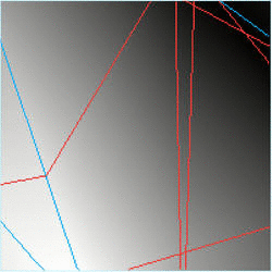
The background represents the predicted probability of a white pixel. The blue lines are the first layer’s non-linear boundaries, the red lines are the second layer’s non-linear boundaries, and the green lines are the third layer’s non-linear boundaries. Notice how the blue lines can only ever be a straight line across the data space itself, while the red lines can diverge off the blue lines, and the green lines off both the red and blue lines.
Bias shift before weight shift
Changing the bias term for any given neuron translates into shifting a line without changing its slope, while a change of incoming weights alters the slop of a line. Visualising the early stages of learning in one of the training runs reveals that the bias terms are readily and quickly adjusted before weight changes play any significant role (for layer 1, here):
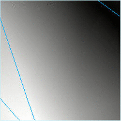
Before the pause the bias changes dominate, and thereafter the weights are adjusted to change the slope of the lines. This is also true for deeper layers (go see for yourself) and even seems to happen over multiple instances during training.
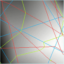
Layer dependences at critical points
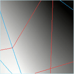
First, note how the latest layer (green, layer 3) can deviate off both earlier layers even though it is not connected to the earliest layer (blue, layer 1). Second, note how the critical points in the data are strongly correlated with deviation points when the network reaches convergence.
Copycats
Different neurons sometimes have identical jobs. This is obviously inefficient, but sometimes difficult to avoid. In this case, two neurons (layer 3, neurons 2 and 6) in the final layer converge to a very similar state:
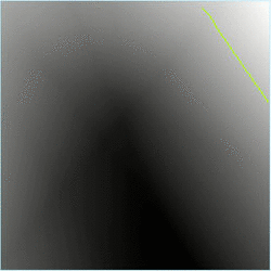
The indecisive neuron
Sometimes neurons converge to a state where small shifts in the loss cause large changes in their decision boundaries:
This was taken toward the end of one of the training runs (layer 3, neuron 4), where the learning rate was close to zero (since it was cosine annealed). This behaviour does not seem to change the predicted output much, nor is it obvious how knowing it occurs could be useful, but it is interesting to witness, nonetheless.
Leveraging symmetries in the data
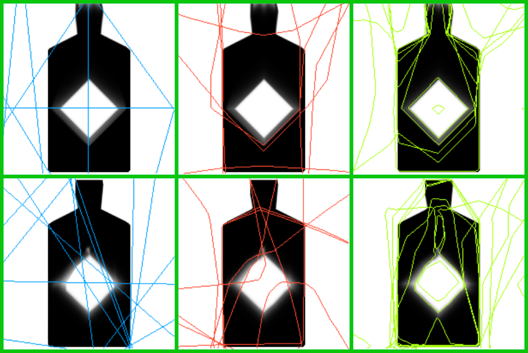
When the network leverages the (obvious, to us) symmetries in the data, the output prediction becomes better: individual neurons can multitask. The above image demonstrates the difference between two converged networks. The better network (top row) does a better job at predicting the data and the non-linear boundaries in all layers exhibit some left-right symmetry inherent in the data. The worse network (bottom row) does not capture the data symmetry nearly as well.
A bad run
Finally, lets take a look at a training run that resulted in a bad reconstruction:
It is unclear what goes wrong in this case to result in this poor reconstruction. It might be that the earlier layers do not find the natural symmetry of the data, or that the initialisation results in later layers favouring certain neurons in earlier layers, thus bounding them within regions that are not useful for modelling the central diamond shape. It is interesting, however, to compare how much better this network does at modelling the top of the bottle:

Suppose we made this network deeper and/or wider - it may be able to devote more energy to the bottle top while still adequately modelling the central diamond.
There are many more hidden gems in these illustrations. I hope that this post has been both educational and inspiring. Go play/work/explore.